Facebook Places logo mocks Foursquare

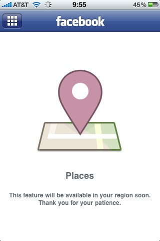
Our imagination may run wild sometimes when it comes to analyzing logos, images and icons, but what we want to show you today is the undeniable truth. Let’s take a look at the Facebook iPhone app icon of the just launched Facebook Places feature.
 As you can see in the screenshot the geolocation feature’s not available to New Yorkers yet *shrugs* but that’s not the point. Facebook’s current biggest competitor, err, “partner” when it comes to checking into places is obviously Foursquare. Now take a look at the Places icon again, and the bottom part specifically. Isn’t that a square… and those crossing roads, don’t they look an awful lot like a certain number?
Four-in-a-square.
Clever? Or just plain evil? What do you think?
Dennis Crowley, chief executive of Foursquare, has not yet responded to the logo reference, but he told the New York Times that the company will “wait to see what the product looks like, play around with it and see if its something we want to integrate with.“